Rolex Oyster Perpetual Dial Colors Compared: Black, Blue, Silver, Green and Bright Dials
Rolex Oyster Perpetual Dial Colors Compared: Black, Blue, Silver, Green and Bright Dials
Choosing the right Rolex Oyster Perpetual size is already difficult.
But once you decide between 36mm and 41mm, another question appears immediately:
Which dial color should you actually buy?
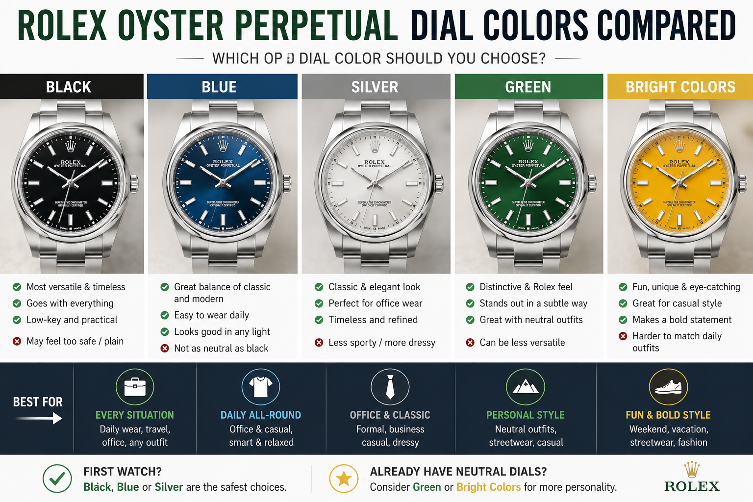
Black looks clean and easy. Blue feels modern and slightly more interesting. Silver looks classic and elegant. Green feels more special. Bright colors look fun in photos, but may be harder to wear every day.
The Oyster Perpetual is one of the simplest Rolex designs, so dial color matters more than many buyers expect. There is no date window, no rotating bezel, no chronograph, and no fluted bezel. The dial becomes the main personality of the watch.
This guide compares the most practical Oyster Perpetual dial colors for real daily wear, office style, casual outfits, wrist size, first-time buyers, and replica watch buyers who want a clean Rolex-style everyday watch.
The Short Answer
Choose black if you want the safest and most versatile Oyster Perpetual.
Choose blue if you want a daily watch with more personality but still easy to wear.
Choose silver if you prefer a classic, elegant, and slightly dressier look.
Choose green if you want a more distinctive Rolex-style watch that still feels wearable.
Choose bright colors only if you already know your style and want the watch to stand out.
For most first-time buyers, black, blue, and silver are the safest choices. Green is the most interesting choice. Bright colors are the most fun but also the easiest to regret if you want one watch for everything.
Why Dial Color Matters So Much on the Oyster Perpetual
The Oyster Perpetual is simple by design. That is the whole appeal.
Compared with a Datejust, it does not have a cyclops date window, Jubilee bracelet option, or fluted bezel. Compared with a Submariner, it does not have a rotating bezel or dive-watch presence. Compared with a GMT-Master II, it does not have a colorful bezel or travel function.
That means the dial color carries a lot of the watch’s personality.
A black Oyster Perpetual feels quiet and practical.
A blue Oyster Perpetual feels modern and polished.
A silver Oyster Perpetual feels classic and mature.
A green Oyster Perpetual feels more collectible and expressive.
A bright dial Oyster Perpetual feels playful and attention-grabbing.
Before you choose a color, make sure you have already chosen the right case size. If you are still unsure, read our guide to Rolex Oyster Perpetual 36 vs 41 first. Size and dial color work together. A bright dial in 41mm feels much louder than the same color in 36mm.
A Real Buyer Scenario
Imagine a buyer choosing his first Rolex-style everyday watch.
He works in a business-casual office. Most days he wears simple shirts, knit polos, jeans, clean sneakers, and sometimes a jacket. He wants one watch that feels good at work and on weekends.
At first, he likes the green dial because it looks special in photos. Then he sees a bright dial version and thinks it looks more exciting. But when he imagines wearing it every Monday morning, the color feels a little too strong.
Then he tries black. It looks good with everything, but maybe too safe. Blue feels like the middle ground. It still looks like a daily watch, but it has enough color to feel personal.
That is exactly how many Oyster Perpetual buyers decide.
The best dial is not always the most exciting dial. It is the dial you still want to wear after the first month.
Black Dial: The Safest Everyday Choice
The black dial Oyster Perpetual is the easiest version to recommend.
It works with almost everything. Office clothes, casual outfits, travel clothes, denim, black T-shirts, white shirts, jackets, sneakers, leather shoes — the black dial never feels out of place.
It also makes the watch look slightly smaller and sharper. This matters especially on the Oyster Perpetual 41, where lighter dials can make the case feel visually larger. A black dial controls the size and gives the watch a cleaner, more compact look.
The black dial is also a good choice if you want a low-key Rolex-style watch. It does not pull too much attention. It feels practical, simple, and mature.
For replica buyers, black is usually one of the easiest daily choices because it is flexible and less dependent on outfit matching. Still, you should check marker alignment, hand finishing, dial printing, bracelet fit, and real wrist appearance. Our replica watch QC checklist before buying explains what to review before confirming a watch.
Where the Black Dial Can Feel Too Plain
The only real problem with black is that it may feel too safe.
If you are buying your first serious watch, safe can be good. But if you already own several black-dial watches, another black Oyster Perpetual may not feel special enough.
Black is also less expressive in photos. It looks clean in real life, but it may not create the same immediate excitement as blue, green, or bright colors.
Choose black if you value long-term wearability more than instant excitement.
Do not choose black only because you are afraid to choose something else. If blue or silver fits your wardrobe better, they can be just as practical.
Blue Dial: The Best Balance of Safe and Interesting
The blue dial Oyster Perpetual may be the best middle-ground choice.
It is more interesting than black but still easy to wear. It works with navy, gray, white, denim, beige, black, and many business-casual outfits. It also feels modern without becoming too loud.
Blue is especially strong if you want one watch that looks good both at work and on weekends. It has personality, but not so much personality that it controls your outfit.
On a 36mm Oyster Perpetual, blue feels refined and versatile. On a 41mm Oyster Perpetual, blue feels more sporty and modern.
This is a strong choice for buyers who looked at black and thought, “Nice, but a little boring.”
It is also a strong choice for replica buyers because blue is desirable, wearable, and visually appealing in wrist shots. Before buying, compare the dial tone under different lighting. Some blue dials look calm indoors and brighter outside, so ask for natural-light photos when possible.
Where the Blue Dial Can Be Tricky
Blue is versatile, but it is not completely neutral.
If your wardrobe is mostly black, brown, cream, olive, or warm tones, blue may not blend as smoothly as black or silver. It can still work, but it may feel more like an intentional color choice.
Blue can also look different depending on lighting. In some photos it appears deep and elegant. In others, it looks brighter and more casual.
A practical test: look at your five most-worn outfits. If blue fits at least three of them naturally, it is probably safe. If it only fits one or two, black or silver may be easier.
Silver Dial: The Classic and Elegant Choice
The silver dial Oyster Perpetual is one of the most underrated choices.
It feels classic, clean, and slightly dressier than black or blue. It works very well with office clothes, white shirts, gray jackets, knitwear, and more mature daily outfits.
Silver also gives the Oyster Perpetual a quieter luxury feeling. It does not shout. It blends with the steel case and bracelet, creating a soft, monochrome look.
If you like the Datejust but want something simpler, silver is a strong Oyster Perpetual dial color. It gives you some of that classic Rolex elegance without the date window or fluted bezel.
If you are still deciding between the Oyster Perpetual and Datejust, compare this article with our guide to Rolex Oyster Perpetual vs Datejust. The Datejust gives more traditional Rolex detail; the Oyster Perpetual keeps the look cleaner.
Where the Silver Dial Can Feel Less Sporty
Silver is elegant, but it can feel less sporty than black or blue.
If your daily style is mostly hoodies, sneakers, casual denim, outdoor jackets, or streetwear, silver may feel slightly more formal. It can still work, but it does not have the same casual energy as black or blue.
Silver can also make the dial look more open. On the 41mm version, this may make the watch feel larger. On the 36mm version, silver usually feels very balanced.
Choose silver if your style is clean, classic, office-friendly, and understated.
Avoid silver if you want the watch to feel sporty, bold, or high-contrast.
Green Dial: The Distinctive Rolex-Style Choice
The green dial Oyster Perpetual is for buyers who want something more special.
Green has a strong connection with Rolex’s brand identity, and it gives the simple Oyster Perpetual design more character. It looks more distinctive than black, blue, or silver, but it can still be wearable if your wardrobe supports it.
Green works best with neutral clothing: white, black, gray, navy, beige, denim, and earth tones. It becomes harder if your wardrobe already has many strong colors.
The green dial is a good choice if you want a watch that feels personal and recognizable without choosing a larger sports model. It is also a strong option for buyers who already have a black or blue watch and want more variety.
For replica buyers, green can be attractive because it gives the watch a more memorable look. The key is to check the dial shade carefully. Green tones can look very different in indoor lighting, sunlight, and product photos.
Where the Green Dial Can Be Harder to Wear
Green is not as universal as black, blue, or silver.
It can feel perfect with some outfits and slightly disconnected with others. This does not mean green is a bad choice. It simply means you should choose it because you like the color, not because you think it is the safest option.
Green can also feel more noticeable in daily life. If you want a quiet office watch, black or silver may be easier. If you want your Oyster Perpetual to have more personality, green makes sense.
A good rule: choose green if you would still want the watch even if it were not the most talked-about color.
Bright Dials: Fun, Stylish, but Not for Everyone
Bright Oyster Perpetual dials are exciting because they make a simple watch feel playful.
They look great in photos. They catch attention. They can make the watch feel younger, more casual, and more fashion-oriented.
But they are not the safest choice for everyone.
A bright dial can become the center of your outfit. That may be exactly what you want. But if you are buying only one everyday watch, you may find it harder to wear five days a week.
Bright dials work best if you already have a neutral daily watch, or if your personal style is confident and casual. They also work better in 36mm for many buyers because the smaller case keeps the color controlled.
For a first Oyster Perpetual, black, blue, silver, or green is usually safer. For a second watch, a bright dial can be much more fun.
Which Dial Color Is Best for Office Wear?
For office wear, black, silver, and blue are the strongest choices.
Black is the safest. It looks professional and does not draw attention.
Silver is the most elegant. It pairs well with shirts, jackets, and business-casual clothing.
Blue is the most balanced. It adds interest without becoming too loud.
Green can work in a modern office, especially with neutral clothing. Bright dials are more personal and depend heavily on your workplace.
If your goal is quiet professional style, you may also enjoy our guide to best replica watches for office wear, where Oyster-style watches, Datejust-style watches, Aqua Terra-style watches, and Cartier-inspired dress styles all make sense for different office wardrobes.
Which Dial Color Is Best for Casual Daily Wear?
For casual daily wear, black and blue are the easiest.
Black works with everything and feels relaxed.
Blue works especially well with denim, navy, white, gray, and casual weekend clothing.
Green is also strong if your wardrobe is neutral. It gives simple outfits more personality.
Silver is slightly dressier, but still wearable. It is best if your casual style is clean and minimal rather than sporty.
Bright dials are best for people who enjoy color in their outfits. If your daily clothes are mostly neutral, a bright dial can become a fun accent. If your clothes already have many colors, it may be harder to match.
For more everyday options, read our guide to best everyday replica watches. It helps compare Oyster-style watches with Datejust, Aqua Terra, Santos, Submariner, and Explorer-style daily choices.
Which Dial Color Looks Best on Small Wrists?
On small wrists, black and blue are usually the safest.
Black makes the watch look slightly smaller and more controlled. Blue gives personality without making the dial feel too large.
Silver works very well on the 36mm Oyster Perpetual, especially if you want a classic look. But on some wrists, silver can make the dial feel more open.
Green can be excellent on small wrists because the 36mm case keeps the color balanced.
Bright dials can also work well in 36mm because the smaller size keeps them playful rather than overpowering.
If your wrist is small and you are comparing several models, our guide to best replica watches for small wrists can help you compare Oyster Perpetual, Datejust 36, Cartier Santos Medium, Tank, Aqua Terra 38, and other wearable choices.
Which Dial Color Looks Best in 41mm?
In 41mm, black and blue are the most forgiving.
Black reduces visual size. Blue gives presence without feeling too loud.
Silver can look beautiful in 41mm, but it may feel larger because the dial surface looks more open. This is not a problem for medium to large wrists, but smaller wrists should be careful.
Green in 41mm has strong personality. It is not quiet, but it can look excellent if you want the watch to feel more distinctive.
Bright dials in 41mm are the boldest choice. They can look stylish, but they are not usually the safest one-watch option.
The larger the case, the more important the dial color becomes. A neutral 41mm can feel easy. A bright 41mm can feel very noticeable.
Replica Buying Angle: Which OP Dial Color Makes the Most Sense?
For replica Oyster Perpetual buyers, the best dial color depends on purpose.
If this is your first replica watch, choose black, blue, or silver. These colors are easier to wear and easier to keep in your rotation.
If you already own a neutral daily watch, green or a brighter dial can make more sense because it adds variety.
Before choosing, ask for clear photos in different lighting. Dial color is one of the easiest things to misjudge from product photos. A color that looks perfect in studio lighting may feel different on the wrist.
Also check the full watch, not just the dial. Look at case shape, bracelet finish, clasp feel, marker alignment, hand length, crystal clarity, and overall wrist balance.
For a broader dial-color comparison across replica watches, read our replica watch dial color guide. It explains why black, blue, white, silver, green, and champagne create different wearing effects.
If this is your first replica purchase, start with our best first replica watch to buy guide before deciding only by color.
What Dial Color Should First-Time Buyers Choose?
For most first-time buyers, blue is the best balance.
It is more interesting than black, safer than green, less formal than silver, and much easier than bright colors.
Black is the safest long-term choice.
Silver is the best classic choice.
Green is the best personality choice.
Bright colors are best when you already know you want something playful.
A first watch should be easy to wear. It should not require a perfect outfit. It should not sit in the box because the color feels difficult.
That is why black, blue, and silver usually win for first-time buyers.
What Dial Color Ages Best?
Black ages best because it is neutral and timeless.
Silver also ages very well because it feels classic and mature.
Blue usually ages well if the tone is not too bright. A deep blue dial remains wearable for years.
Green can age well if you truly like the color, but it is more personality-driven.
Bright colors depend on your style. They may feel exciting now and less practical later. Or they may become the most fun watch in your collection. The difference is whether you bought the color because you loved it or because it was trending.
For long-term wear, choose the dial that fits your real clothes, not the dial that gets the most attention online.
Simple Decision Checklist
Choose black if you want maximum versatility, a low-key look, and the safest daily watch.
Choose blue if you want a daily watch that feels modern, balanced, and slightly more interesting.
Choose silver if you want classic elegance, office friendliness, and a clean steel-on-steel look.
Choose green if you want personality, Rolex-style identity, and a more distinctive daily watch.
Choose a bright dial if you want fun, color, and strong wrist presence.
The more often you plan to wear the watch, the safer the color should be.
The more watches you already own, the more expressive you can be.
Final Verdict
The best Rolex Oyster Perpetual dial color for most buyers is blue because it balances daily wear, personality, and long-term versatility.
The safest choice is black.
The most elegant choice is silver.
The most distinctive wearable choice is green.
The most playful choice is a bright dial.
For a first Oyster Perpetual, choose black, blue, or silver. For a more personal watch, choose green. For a fun collection piece, choose a bright color.
The Oyster Perpetual is simple, so the dial color defines the whole watch. Choose the color you can wear on a normal Tuesday morning, not only the one that looks best in a close-up photo.
